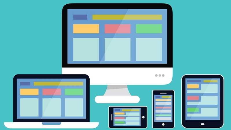
1. Responsive design plan
Mobile traffic to the website has been increasing in recent times. Today mobile users are the ones with large percentage of traffic from any website. It has become important to optimise the mobile devices to improve the response of the web. the best approach one can take while designing a web experience for mobile is ‘Mobile First’. A good plan in the initial stage can be beneficial and you can also visit https://vimi.co/ for a better understanding
2. Consider content
There are times when the responsive web design fit content unnecessarily due to which there is a whole lot of traffic in the web. it becomes important for them to consider the correct quantity of content to be added in certain columns. this process is known as
‘Fit-to-size’ process.
3. Prioritize
Sometimes we do not consider removing certain contents from the mobile experience and the responsive web is not functioning adequately. that’s when it is important to prioritise the important things to be kept on the top while others you can keep it hidden.
4. Use Scalable Vector Graphics (SVG’s)
A Good responsive web will have plenty scalable vector graphics that uses illustrations like icons. the results of this is everything looks polished on the website whenever it is been viewed. they also save some time during the loading because the file size is smaller.
5. Responsive Imagery
For a very good responsive experience it is best to use two different versions of the same image for different devices as per requirements. This will ensure faster responsive web as the loading time will reduce and be effective.
6. Think Topography
The most important part of a responsive web is the legibility of a site across all the platforms and devices especially on mobile. make sure the content is easy to read and very optimised to device size so that readers can actually read and understand your message.
7. Standardized Clickable Area Buttons.
It is important to understand the size of the clickable area buttons for different devices. For a good responsive web it is essential that the clickable area buttons according to the size of the tap. It has to be bigger for mobile phones because the usage your is with fingers and could be comparatively smaller for laptops and desktops because of the use of mouse.

